媒体查询
是的,只需从左上角选择设备 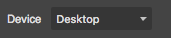换个风格。 你也可以添加自定义断点,查看 [API-Device-Manager](https://github.com/artf/grapesjs/wiki/API-Device-Manager) 页面。
阅读下方完整回答 ↓问题
有没有办法在特定宽度上应用 css,比如 (max-width:767px),这样我们就能让模板响应式???
回答(3)
是的,只需从左上角选择设备 换个风格。
你也可以添加自定义断点,查看 [API-Device-Manager](https://github.com/artf/grapesjs/wiki/API-Device-Manager) 页面。
好的,谢谢你的留言
由于关闭后没有近期活动,该帖子已被自动锁定。请为相关漏洞开启新一期。
相关问答
通过相似的问题讨论继续研究。
问题 #1066
获取包含内联CSS的内容
我一直在寻找一些解释,发现有些邮件客户端会屏蔽CSS...... 我想知道有没有办法让编辑器的 HTML 中所有 CSS 都内联,比如 '<div style=“color:red; max-width: 100px”></div>' 而不是 classs
问题 #1506
CSS 媒体查询问题
你好@artf 演示页面和媒体查询库中都存在问题。 问题是,如果用户先在移动视图上更新样式,再用标签视图,再用媒体查询,移动视图就不起作用。如果我们先更新桌面样式,再更新标签页,再更新移动端,那么一切都正常 但如果我们先反向移动视图,标签视图第二,桌面视图第三,然后CSS/媒体...
问题 #2011
构建 gjs 组件
大家好, 我正在使用 grapesjs-webpage-preset 插件,我想把我的 gjs-html 和 gjs-css 结合起来,这样所有样式都是内联的。 我之前用“juice”做到了,现在我想基于我新合并的 gjs-html 和内联 css 来存储 gjs-compon...
问题 #1979
:样式管理器选项,始终编辑单个元素
我用这个很棒的库只编辑页面的部分内容。 我主要设计的是页面上可用的 Compontens,使用样式管理器时,它通常只对所选元素生效,而非其类。 所以目前我总是得取消选择卡并进行编辑。 有没有可能添加一个选项,让样式管理器始终使用该 ID 来生成 CSS?
与此问题匹配的付费插件
根据问题关键词和标签相关性精选,助你更快交付。
正在加载付费插件推荐……
相关教程
关于同一主题的深入指南。
浏览插件分类
直接跳转到市场上的插件分类页面。